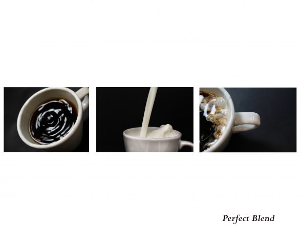
I’m starting a regular segment on my blog called “Image Critiques”. The Image Critiques will allow you to know my thought process when I see an image at the same time, helping you see a different perspective on the original work. Like with most things related to creativity, a critique is subjective and by no means the “right” way. The first critique is by one of my good friend’s students qualifying for the Skills Canada competition. This triptych by Kat Boomhower represents the theme “together”.

Photos by: Kat Boomhower
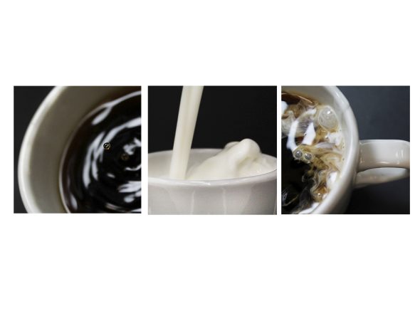
I think the concept is very well done and each image is great on its own, especially the two side images. I can see either of those being really nice to use in advertising as they’d have enough negative space to drop in some text for a print or billboard ad. That being said, I think as a group it has a potential of being a stronger submission if they were cropped in a bit tighter and all square (square because the 3:1 ratio is very pleasing to the eye).
I think the first image has that really tack sharp (at least it looks sharp to me) droplet of coffee that I think is amazing and very interesting. Unless it is cropped tighter the droplet is a bit lost in the sea of coffee that surrounds it.
The second image horizon line might be a bit off which is creating a bit of tension for me. Again, the most interesting part of the middle image to me is the milk or cream and the wave it is creating. Also, it could be a bit brighter, on my monitor it appears a bit dark, it could just use a quick curve adjustment.
The third image is my favourite because it could totally be an advertisement for coffee on its own. I just imagine the point of view being someone who’s about to pick it up and drink it. Very well done. Except, I think there is too much negative space on the right for this application specifically.

Photos by: Kat Boomhower
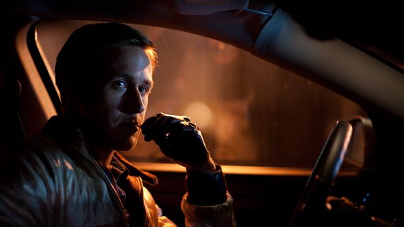
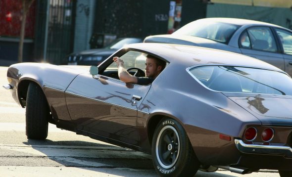
Sometimes pictures are about efficiency and sticking to one subject to highlight and dominate. In this case, a tighter, cropped-in photo works because you can connect to the main subjects which are the liquids. The original photos were wider and allowed the coffee mug to dominate the same amount of space as the liquids. Similar to the movies, when you see a close-up of the people at the steering wheel, you know they are driving a car even though they don’t show the whole car. A tighter close-up highlights the subject, which is the actor and not the car (most of the time). Out of the two examples below, which photo connects you to Ryan Gosling you more?

Scene from Drive (FilmDistrict)

Source: jesda.com
I was fortunate to meet Kat during an exhibition of her work, she has some very good talent and I’m happy to say that she qualified for provincials!
Leave a Reply